e-commerce design for CustomiseMe startup

Summary

Project goal

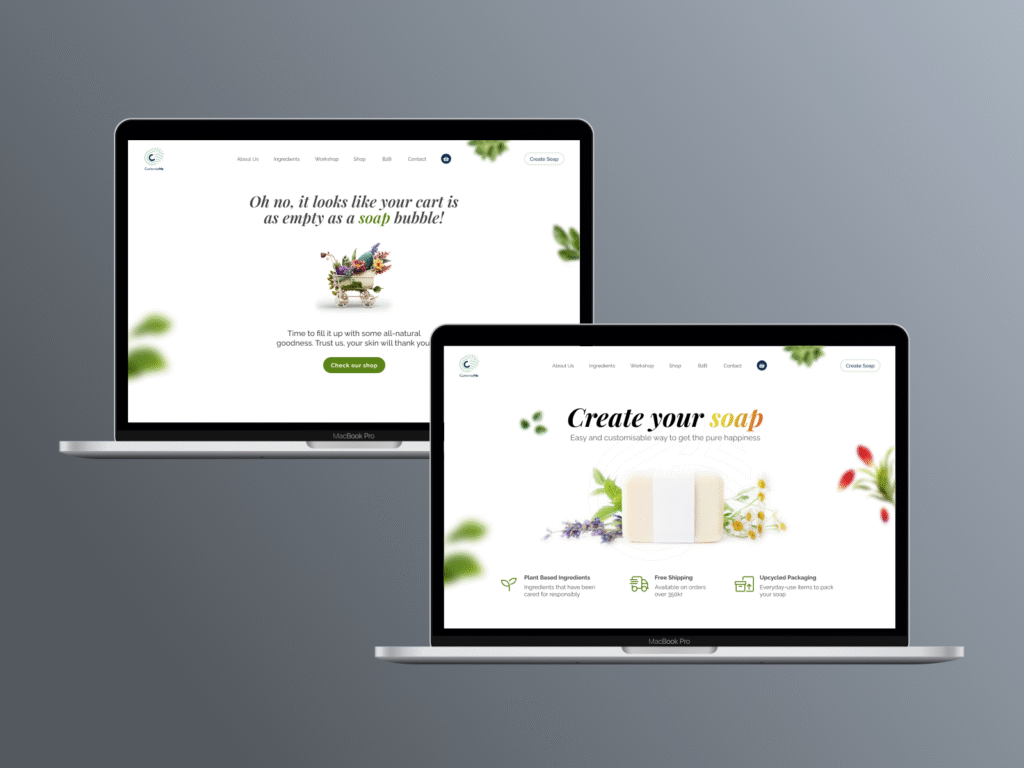
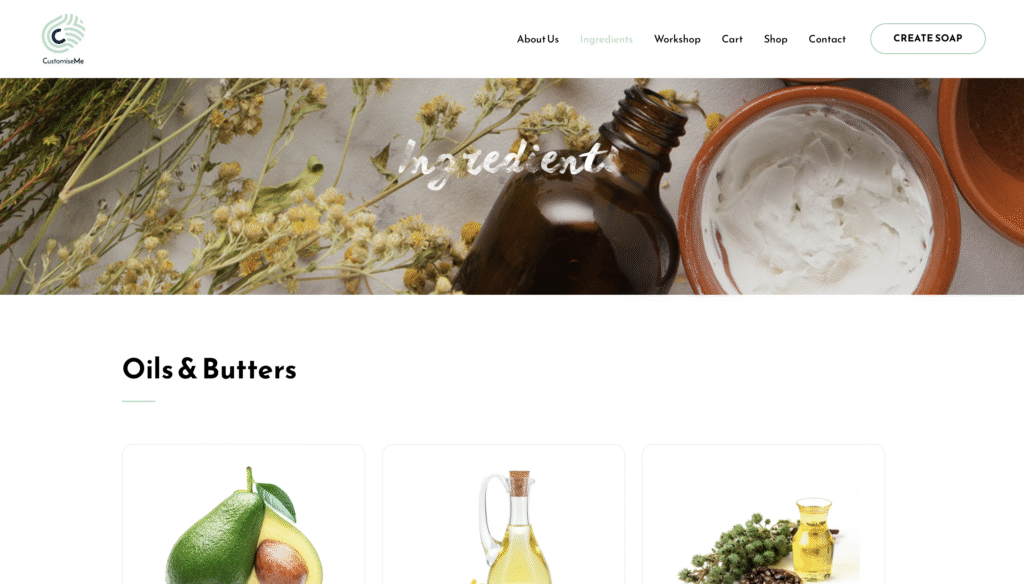
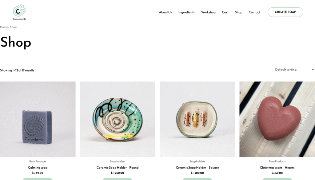
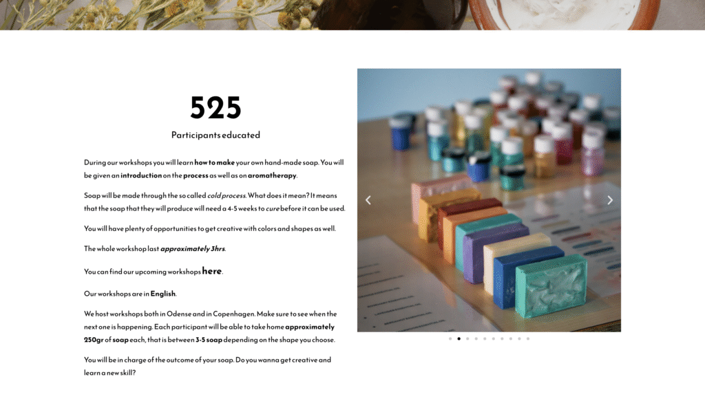
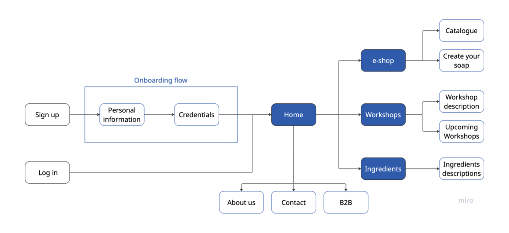
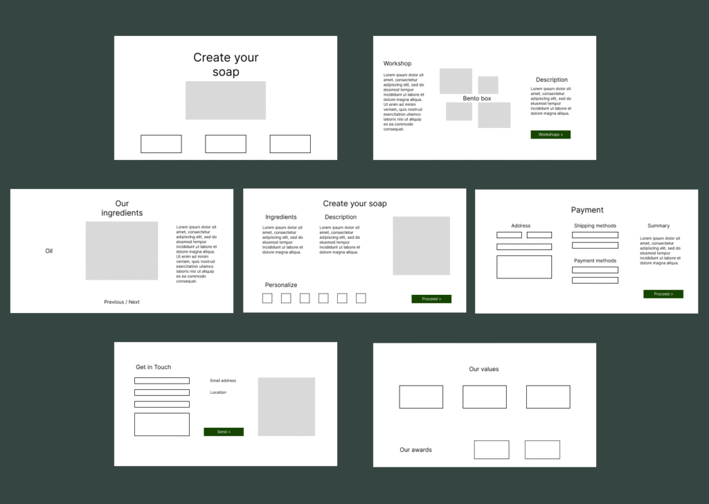
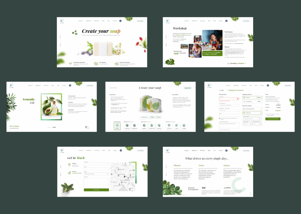
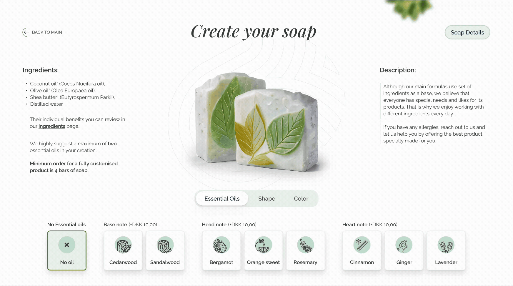
Redesigning CustomiseMe’s website to create a modern, visually consistent and user-friendly online presence.

The focus was on improving the website’s usability, readability, and overall brand storytelling while ensuring that the design supported both functionality and aesthetics.

The CEO had already studied target audience, so the need for UX analysis was limited.

My Contributions

Being the project focused on UI Design, I began by redesigning the website on Figma, creating a clean and engaging interface, balancing strong visual identity with intuitive navigation.

Afterwards, I implemented it on WordPress, ensuring brand alignment, responsiveness. The website that delivers a better user experience and aligns with the client’s brand vision.

Client

CustomiseMe

2025, Odense (Denmark

Services

  • UI Design
  • A/B Testing
  • Web Design
  • WordPress development

My roles

Digital Product Designer | UI Designer

The original design

The existing CustomiseMe website had a cluttered interface with poor navigation, low color-contrast and lack of information architecture.

Lack of Information Architecture

Content is not organized in a clear, logical flow, making it harder for users to navigate the website smoothly.

Legibility Issues

Text is hard to read due to low contrast, poor sizing and busy backgrounds, reducing clarity and accessibility.

CTA Hierarchy

All the calls to action compete equally, leaving users unsure of the main action to take, weakening conversions.

Screenshots from the original designs

Launching the MVP

With CustomiseMe preparing to update their online presence, my first challenge was designing the MVP and getting it ready for launch.

Discovery

I started to understand the CEO’s vision and the plans he had for the product. He was pushing for a total rebranding, as the actual website was made by himself. The overall user flow had to be rethought, paving the way for customers to a smoother user experience, from first visit to checkout.

We decided to focus on 3 macro-sections: an e-shop, a presentation of the workshops and a description of the sustainable products used. This focused scope allowed us to launch faster while underlining the company’s values towards sustainability.

Planning the Website Structure

After identifying the key areas to focus on, I moved on design the user flows for different user roles. Different levels of access to the tools and information had to be considered, requiring careful planning upfront. Using flow charts helped to move faster and avoid having to rework parts of the website later.

e-commerce Flowchart

UI Design - Wireframing

I created wireframes to define the structure and layout of the interface, focusing on hierarchy, functionality, and user flow without being distracted by visual design elements. This process helped me plan the core experience and ensure that navigation and interactions were clear and intuitive from the start.

e-commerce Wireframes

UI Design - Prototyping

I developed interactive prototypes to bring the wireframes to life, allowing me to simulate real user interactions and test usability. Prototyping enabled me to gather feedback, identify potential issues, and refine the overall user experience.

e-commerce Prototypes

UI Principles

The foundational design principles that shaped every decision

Visual hierarchy

Visual hierarchy guides the user to navigate the webpage,  paving the way for their experience.

Color hierarchy

Colors are used to guide attention toward the most important elements. Supporting colors establish secondary importance and balance.

Consistency

Repeated use of typography, icons, button styles, and patterns builds familiarity, reducing cognitive load by making interactions predictable.

Whitespace

Spacing allows the design to “breathe”, strengthening hierarchy by grouping related content.

Accessibility

Legible typography ensure that content is accessible to a broad audience.

User guidance

Complex processes are broken down into clear steps and patterns, minimizing user frustration.

Let's make something awesome together