App design & UX research for Tutora

Summary

Project goal

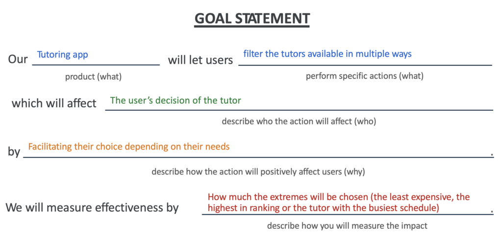
This project was developed as part of the Google UX Design Professional Certificate on Coursera. The goal was to design a tutoring platform for parents to easily find and book tutors for their children.

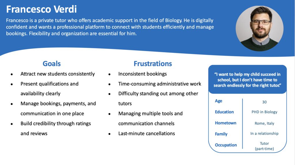
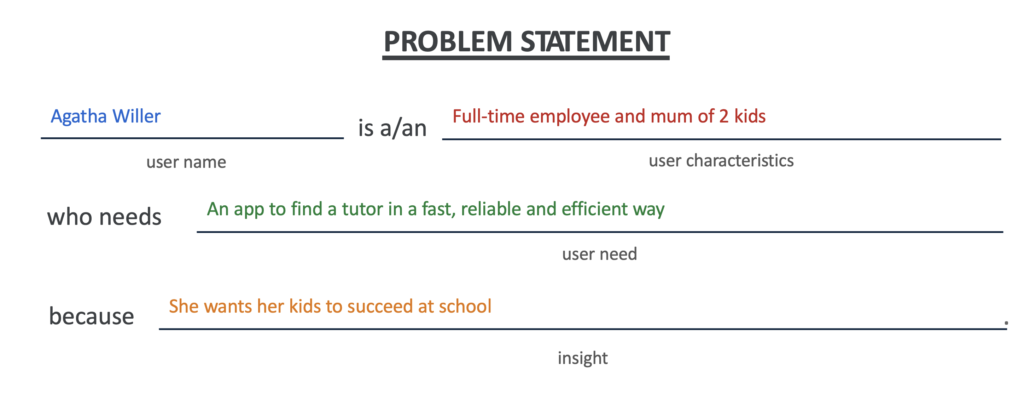
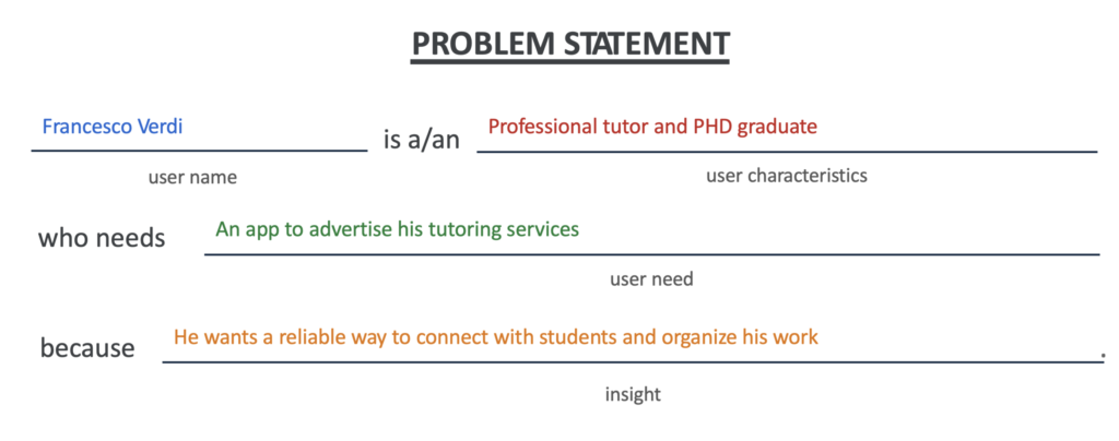
The design process followed a user-centered approach, as I conducted user research to identify common pain points target users encounter when searching for tutors online.

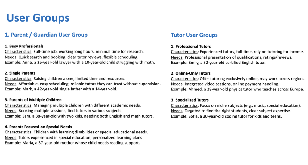
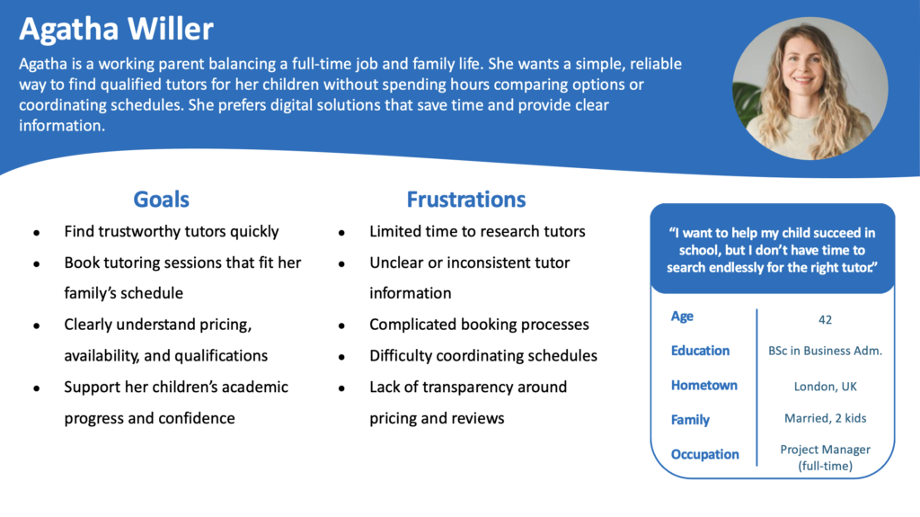
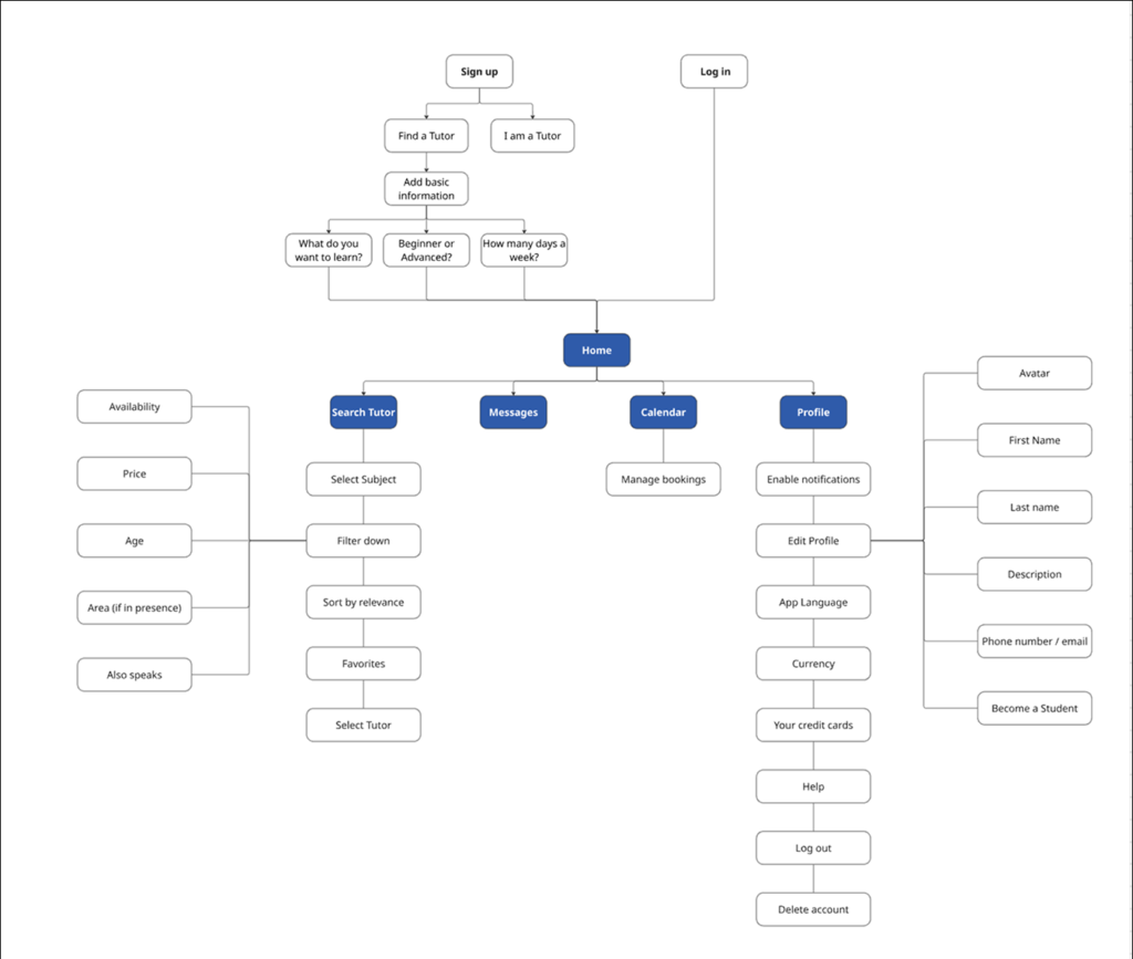
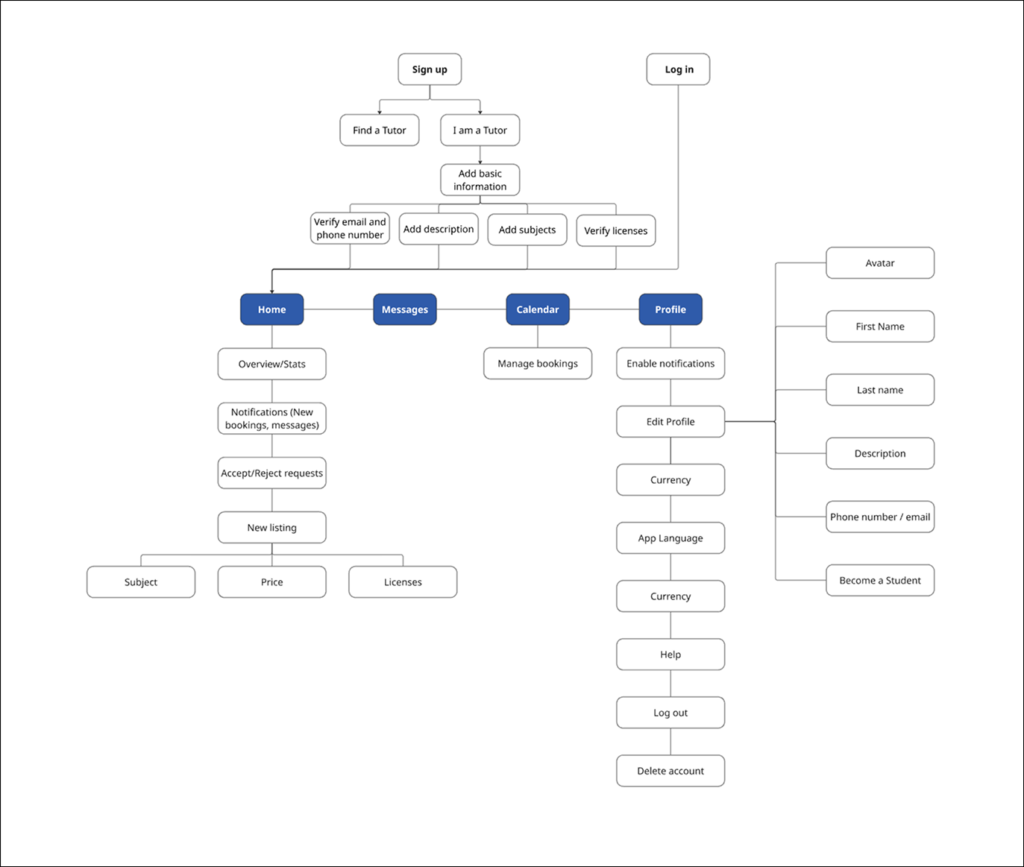
I created personas, user stories, and user flows to better understand user motivations and frustrations.

My Contributions

After conducting user research, I created a scalable Design System on Figma before developing paper wireframes, digital mockups and interactive prototypes.

A continuous iteration process throughout the design to integrate accessibility has been assessed.

Client

Tutora

2026, Catania (Italy)

Services

  • UX Design
  • App Design

My role

UX/UI Designer | Design Lead

User Research

The user research phase aimed to build a deep understanding of the needs and behaviors of potential users.

User Groups

I identified the primary user groups for the platform: parents seeking tutors for their children & tutors offering educational services.

This step helped define the target audience and ensured that the design addressed the needs of both sides.

User Groups Analysis
User Groups Analysis - Parents & Tutors

Persona Creation

Based on the identified user groups, I developed two personas: one representing parents and one representing tutors. These personas are reference point throughout the design process.

Persona 1: Parent
Persona 2: Tutor

Understanding the Target Users

To further define user needs, I created problem statements for both personas and a goal statement to align the overall product vision. This helped translate research insights into user-centered solutions.

Problem Statement
Problem Statement 1: Parent
Problem Statement 2: Tutor
Goal Statement: Making sure the app targets the right pain points

Competitors' analysis

I conducted a competitors’ analysis to evaluate existing tutoring platforms, identifying strengths, weaknesses, and opportunities. These insights informed design decisions and helped position the app with a user-focused experience.

Competitors' analysis: Preply, Wyzant & Superprof

Low-fidelity Wireframes

This phase focused on translating initial ideas into tangible design concepts.

Starting from the user needs I created two separate user flows before creating the first paper wireframes.

User Flows creation

I mapped out the complete user flows on Miro for both parents and tutors, covering the main journey from registration to booking a session.

This helped ensure that all key steps were aligned with user expectations across the platform.

Student User Flow
User Flow 1: Parent
User Flow 2: Tutor

Paper Wireframes

Based on the user flows, I created paper wireframes to visualize the layout structure. This rapid ideation process allowed me to experiment with different solutions and refine the overall navigation before moving into digital design.

Paper Wireframes
Paper Wireframes of 3 screens

Design System

I developed a design system to ensure visual consistency and scalability.

It defines the core visual elements and guidelines used throughout the interface, creating a cohesive and recognizable user experience.

High-fidelity Prototypes

I developed a design system to ensure visual consistency and scalability.

It defines the core visual elements and guidelines used throughout the interface, creating a cohesive and recognizable user experience.

Onboarding

I selected a clear and readable type system to establish hierarchy and improve content accessibility. Different font styles and sizes were defined to guide users’ attention and ensure consistency across all screens.

Book a Tutor

I selected a clear and readable type system to establish hierarchy and improve content accessibility. Different font styles and sizes were defined to guide users’ attention and ensure consistency across all screens.

Search, Calendar & Settings

I selected a clear and readable type system to establish hierarchy and improve content accessibility. Different font styles and sizes were defined to guide users’ attention and ensure consistency across all screens.

Typography

I selected a clear and readable type system to establish hierarchy and improve content accessibility. Different font styles and sizes were defined to guide users’ attention and ensure consistency across all screens.

Typography
Typography, Typefaces & Type pairings

Colors

A consistent color palette was created to reflect the app’s identity and enhance usability. Colors were chosen to support visual hierarchy, highlight key actions, and maintain accessibility standards.

The 60 – 30 – 10 Color Composition rule was adopted in order to guarantee visual balance.

Color Scheme
Typography, Typefaces & Type pairings

Icons & Grids

A cohesive icon set was used to support navigation and improve usability through clear visual cues. Grid systems were applied to ensure alignment, spacing consistency, and a balanced layout across all screens.

Icons & Grids
Typography, Typefaces & Type pairings

Components

Reusable components were designed to maintain consistency and efficiency throughout the interface. These include buttons, cards, input fields, and navigation elements, all standardized to support scalability and streamline the design process.

Typography, Typefaces & Type pairings

AI-image creation

To enhance the visual appeal of the interface, I used Nano Banana Pro AI to generate 3D objects that align with the app’s aesthetic.

These assets were then refined in Adobe Illustrator, allowing for precise adjustments to ensure consistency with the overall design system.

Key takeaways

  • User research is essential to uncover real needs and challenge initial assumptions


  • Iterative design and usability testing significantly improve the overall user experience


  • A well-defined design system ensures consistency and scalability across the product


  • Accessibility should be considered from the early stages of the design process


  • Moving from low-fidelity to high-fidelity designs helps refine ideas efficiently

Let's make something awesome together